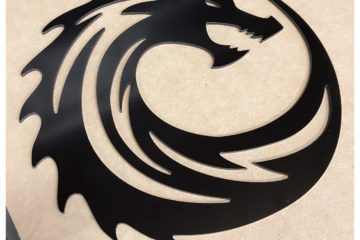
If you want people to discover, locate, or even remember your business, it’s expected that you should have some kind of sign out front. If you didn’t, customers would struggle to find you (even if Google Maps takes them to your door, how will they differentiate between your company and someone’s house?) and – if they did manage to stumble in – remember you. Whilst signage is a given for any established business, companies should think more about good signage. Good signage includes eye-catching signs that are fit for the target audience, and sturdy enough to endure the seasons. A pinned-up banner might do for now – but consider investing in a stronger acrylic or wooden sign in the long run.
MAKE IT EYECATCHING
It’s all well and good having a nice, basic sign out front until your only customers come from your immediate network. Put yourself in the mind of a potential customer. If you were walking down the street looking for a restaurant to eat at, would you pick the place with small, dull lettering or the place with large, colourful engravings? The place with small lettering might completely evade your attention. If you want people to notice your business, make sure your sign has some interesting elements that the eye can be drawn to. Of course, it needs to be appropriate to your business – a huge pizza graphic isn’t going to draw in happy customers for a sandwich shop (unless said sandwich shop also stocks pizza) – but make sure it pops!
KEEP IT SLEEK
Whilst your sign should be eye-catching, it shouldn’t be cluttered. There’s a delicate balance between ‘fun and eye-catching’ and ‘garish’. If your sign is too packed with competing colours and cluttered by graphics, it can potentially send the message that your business isn’t professional. Here at CreativeCNC, we can help you with meeting this balance; acrylic signs are perfect for creating a sleek look that is also eye-catching. Just make sure that you have a logo, font and complementary colour scheme in mind – these should fit the interior feel of your business too!
THINK OF YOUR TARGET AUDIENCE
Here at CreativeCNC, we have worked with a range of organisations from nurseries, to churches, to restaurants, to arcades. Each place has different needs. A nursery might make use of bright colours and a fun font in its front sign. Looking almost childish is a good thing, especially if the colour scheme stays complementary. Engravings (another service offered by CreativeCNC) are also good tools to fit your sign to your target audience. A puzzle engraved into a wooden base would work for a nursery, whilst an arcade might opt for a styled 8-bit logo carved into acrylic.
A pricier restaurant might go for more muted shades and more subtle graphics, whilst a fun family place might opt for something colourful (think McDonald’s). If your sign does not fit your target audience’s expectations for your brand, you might not see many repeat customers. There’s a psychology behind how we interpret patterns, colours and signs; make sure that the message your sign is sending is the right one for the right people!
MAKE IT CUSTOM
Here at CreativeCNC, we have over 30 years of experience working with a range of businesses and organisations. Send a sketch or computer-generated image of your sign design and we will send you a quote. You want your business to stand out, in a good way – what better to do that than by showcasing your brand to the street in style?

0 Comments